


Getting to Grips with Colour
Mixing, Harmony and Contrast
Getting to Grips with Colour: Mixing, Harmony and Contrast
Understanding colour is central to successful painting. Whether you’re working in acrylic, watercolour, or oil, the way you use colour affects mood, focus, and depth. This article explores the essentials of colour theory, including how to mix with confidence, create visual harmony, and avoid common pitfalls. We’ll also introduce practical exercises to help embed these concepts into your painting process.
1. The Colour Wheel: A Practical Tool for Decision-Making
The colour wheel is a visual map of colour relationships. It helps artists plan palettes, balance compositions, and select effective contrasts. The traditional wheel is divided into:
- Primary colours: Red, blue, and yellow – they cannot be mixed from other colours.
- Secondary colours: Orange, green, and purple – created by mixing two primaries.
- Tertiary colours: Red-orange, yellow-green, etc. – made by mixing a primary with a secondary.
Beyond definitions, the colour wheel becomes a decision-making tool when used intentionally. For example:
- Complementary pairs (opposites on the wheel) provide high contrast and energy (e.g. blue and orange).
- Analogous colours (next to each other) offer harmony and unity.
- Triadic schemes (three evenly spaced hues) strike a balance between contrast and cohesion.
Before beginning a painting, many artists refer to the wheel to help build a purposeful and effective palette.
2. Warm vs Cool Colours: Understanding Temperature and Its Emotional Impact
Perceived colour temperature has a profound effect on both mood and spatial perception.
- Warm colours (reds, oranges, yellows) evoke energy, heat, and closeness. They tend to advance visually.
- Cool colours (blues, greens, purples) suggest calm, space, and distance. They often recede in a composition.
Even within a single hue, temperature perception varies. For instance, ultramarine is a warm blue, while phthalo blue is cool. Recognising and using these subtle differences allows you to:
- Create atmospheric depth (e.g. a warm-toned object in the foreground against a cool, distant background).
- Influence emotional tone – energised or tranquil – through your palette choices.
Perceived Temperature is also useful in balancing compositions and guiding the viewer’s eye across the painting.
3. Colour Harmony: Choosing What Works Together
Creating visual harmony isn’t guesswork – it’s grounded in colour theory. Here are three common schemes:
- Complementary: Colours opposite each other (e.g. red and green). These intensify each other when side by side, but can mute each other when mixed.
- Analogous: Neighbouring colours (e.g. yellow, yellow-green, green). Great for soft, unified colour stories.
- Triadic: Three evenly spaced hues (e.g. red, blue, yellow). These schemes maintain vibrancy while staying balanced.
Using harmony intentionally ensures that the colours in your work support, rather than compete with, one another.
4. Single Pigment Colours
When selecting artists’ colours, it’s worth paying attention to whether a paint is formulated using a single pigment rather than a mixture of several.
Single-pigment colours contain just one colouring ingredient, identified by its pigment code (for example, PB29 Ultramarine Blue or PR101 Red Iron Oxide). These paints are highly valued by professional artists because they offer:
- Cleaner colour mixing: When blended with other single-pigment colours, the resulting hues remain bright and true rather than becoming dull or muddy.
- Predictable results: Each pigment has distinct tinting strength, transparency, and undertone, making it easier to anticipate how it will behave in mixtures and glazing.
- Greater control: Artists can build a more refined, personalised palette based on reliable pigment behaviour instead of depending on ready-made mixes.
- Archival reliability: Pigments are tested individually for lightfastness, so knowing exactly what’s in the paint helps ensure long-term stability.
For artists who prioritise purity and precision, especially in watercolour, acrylic, and oil painting, choosing single-pigment paints provides the most consistent path to luminous, clean mixes and lasting results.
5. Mixing with Confidence: Avoiding Muddy Colours and Understanding Bias
Mixing paint is both art and science. Common pitfalls include:
Avoiding Muddy Colours
- Mix small amounts first.
- Clean your tools regularly.
- Avoid mixing too many pigments at once.
- Work with a limited palette: Start with a warm and cool version of each primary plus white and black.
Understanding Pigment Bias
Every pigment has a bias. For example:
- A warm red (cadmium red) mixed with a warm blue (ultramarine) yields a rich purple.
- A cool red (alizarin crimson) with a cool blue (phthalo) makes a cleaner, cooler violet.
Ignoring these biases often results in neutralised, muddy mixes. Observing how individual pigments lean warm or cool is critical for predictable, vibrant results.
6. Tint, Tone and Shade: Adjusting Colours with White, Black, and Grey
Manipulating colour isn’t limited to hue. You also need to understand value and saturation.
- Tint = hue + white: Lightens the colour, useful for highlights or soft atmospheres. It may be worth noting that adding Titanium White not only lightens a colour but also significantly increases its opacity, whereas using Zinc Mixing White results in a much subtler rise in opacity.
- Shade = hue + black: Darkens the colour, adding weight.
- Tone = hue + grey: Lowers intensity without fully darkening or lightening, ideal for subtle transitions.
Practising this with a single colour reveals how much flexibility lies within one tube of paint. It also improves your understanding of how colour behaves in shadow and light.
7. Contrast and Visual Interest: Making Colour Work Harder
Contrast is vital for creating focus and impact in your work. It can be introduced through:
- Hue contrast: Using complementary colours (e.g. red next to green).
- Value contrast: Light vs dark.
- Perceived Temperature contrast: Juxtaposing warm and cool.
- Saturation contrast: Pure vs muted colours.
Too little contrast results in flat, indistinct work. Too much contrast can overwhelm. The key is to apply it deliberately to guide the viewer’s attention.
8. Practical Exercises for Developing Colour Confidence
Build your confidence with hands-on exploration:
1. Limited Palette Painting
Create a small painting using just three primaries and white. This encourages you to mix your own secondary and tertiary colours and improves your control over harmony and value.
2. Colour Mixing Chart
Make swatches for each combination of your palette. Note which mixtures are vibrant and which become neutral. This builds your awareness of pigment interaction.
3. Value Scale Study
Take a single colour and create a 7- to 9-step value scale from lightest tint to darkest shade. This improves tonal awareness.
4. Harmony Scheme Studies
Create three small thumbnail paintings:
- One using a complementary pair.
- One using analogous colours.
- One using a triadic scheme.
These help you observe how different schemes affect unity, energy, and balance.
Summary
Learning to see and mix colour accurately takes time and practice. By using the colour wheel effectively, observing temperature shifts, controlling contrast, and exploring value, you’ll develop a more confident, deliberate approach to colour. These foundational principles apply across all painting mediums and underpin every stylistic choice – from subtle realism to bold abstraction.
With regular practice, your use of colour will become more intuitive, expressive, and effective.
Learning & Resources
-

Ben Woodhams Wins Daler-Rowney Award at The Natural Eye 2026
The Society of Wildlife Artists’ 63rd Annual Exhibition, The Natural Eye 2026, celebrates the extraordinary range of artistic responses to the natural world. This year, Daler-Rowney is delighted to recognise Ben Woodhams SWLA, whose entire body of work submitted for the exhibition received the Daler-Rowney Award. -

An Doan Nguyen
An Doan Nguyen’s paintings move between photorealism and expressive abstraction, combining dramatic light, bold colour and atmospheric compositions to explore the tension between solitude, memory and the vibrancy of life. -

Studio Confessions with Jen Dixon: Creative Risks, Failed Experiments & Finding Your Voice
Behind every finished artwork are the parts we don't always see: the failed experiments, creative risks, moments of self-doubt, unexpected discoveries, and lessons learned along the way. -

Where Sea Meets Land: The Daler-Rowney Prize at the Marine Artists Society Exhibition 2026
The shoreline is never quite the same twice. Tides shift, light changes, rocks are revealed and submerged, and the surface of the water constantly alters the landscape around it. For artists, this meeting point between land and sea offers an ever-changing subject to observe and interpret. -

Women in Art Prize 2026: Celebrating Women Artists and Emerging Talent
The Women in Art Prize has announced the winners of its ninth annual awards, celebrating women artists working across painting, sculpture, photography, printmaking, digital and moving image, as well as creating opportunities for exhibition, mentoring, residencies and international artist development. -

Clarice Gomes
Clarice Gomes is a watercolour artist, author and retreat host known for her pretty, romantic and loose style, using nature-inspired painting to encourage creativity, calm and connection. -

Eva Volf
Eva Volf is a Cleveland-based fine artist known for atmospheric oil-on-canvas seascapes inspired by her travels, coastal memories and connection to the sea, with her work exhibited and collected internationally. -

VIN + OMI ANARCHY: Reimagining Waste Through Fashion, Art and Education
Fashion, art, music and sustainability came together at VIN + OMI's latest London Fashion Week show, ANARCHY, presented on Sunday 13 September 2026 at art'otel London Hoxton.
Frequently Asked Questions
How do you dispose of the tubes and paint?
Can the Watercolour Varnish be thinned and how should I do it?
What type of brush should I use should I use to apply varnish?
Why is the Watercolour Varnish difficult to apply?
What is the difference between lightweight and heavyweight drawing paper?
What is the difference between alla prima vs layered in oil painting?
How do you mix oil paint colours cleanly?
How do you choose the right watercolour paper?
How do you create soft and hard edges in watercolour?
How do you lift watercolour paint safely?
How do you use heavy body vs fluid acrylic?
How do you blend acrylics before they dry?
Canvas vs paper vs board: when to use each
Oil paint drying times: what to expect and why it varies
What does “fat over lean” mean when oil painting?
How do you glaze with oil paint?
How do you build layers when painting with oils?
Wet-on-wet vs wet-on-dry: when do you use each technique?
How do you layer watercolour without lifting previous paint?
How do you paint a clean watercolour wash (flat and graded)?
How do you control water for better watercolour results?
How do you glaze with acrylic for depth?
How do you layer acrylic paint cleanly?
How do you build texture with acrylics?
What paper should I use for watercolour?
Do I need solvents for oil painting?
Why is my oil painting cracking?
What’s the difference between pans and tubes?
Can I layer watercolour?
How do I stop blooms and backruns?
Why do my watercolours dry lighter than expected?
How do I stop streaks in acrylic paint?
Why do my acrylic colours look dull?
Can I use acrylic paint on any surface?
Why is my acrylic paint cracking?
How can I slow down acrylic drying time?
Why does my watercolour appear blotchy or uneven on paper?
How do I improve the water miscibility of the watermixable oils?
Why aren’t my water-mixable oil colours drying quickly enough?
Why is my watercolour paint too thick and hard to brush out?
Why are my oil colours drying too slowly?
Why are my oil colours too thick or difficult to brush out?
Why does my acrylic feel heavy or drag on the brush when painting?
Why is my acrylic paint drying too quickly?
Why does my acrylic paint dry too glossy?
How do I reduce the viscosity of the System3 Screen Printing Medium?
Why does my acrylic paint dry with a finish that is too matt?
Why is my acrylic or gesso too thick, gelatinous, or gloopy?
Do the Georgian Water Mixable Oils contain preservative Methylisothiazolinone and similar synthetic preservatives?
How do I update my preferences or subscribe to your newsletter?
How do I collaborate with/get sponsored by Daler-Rowney?
Where can I download your logo or product images/assets?
I didn’t receive any canvas wedges, where can I request them?
Do you sell other brands?
Can I buy directly from you?
Am I able to order samples?
Do you test on animals or use animal-derived ingredients?
What is the Fine Art Trade Guild?
I have scanned the QR code on the back of the Screen Printing kit product packaging but it does not lead anywhere?
I have scanned the QR code on the back of the product packaging but it does not lead anywhere?
How do I contribute a new how-to to your techniques page?
How do I find out more information about old products?
How do you preserve the longevity of finished artworks on paper?
How do I attach the canvas wedges?
How long do you need to leave an oil painting before varnishing?
I would like to try a medium, what would you advise?
How do you revive paint?
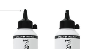
How do you open the Fluid Acrylics tubes?
To open the 250ml and 500ml Fluid Acrylic or many of our larger size paint tubes, cut along the top line as indicated in the image.
My art masking fluid is coagulation and thickening, what should I do?
What do the terms pigments and solvents mean?
What does FSC® mean?
What does hue mean?
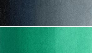
A hue is the actual colour of something. A term often used to refer to the dominant pure colour within a colour.
How do you prepare paper and seal your artwork?
How do you prevent your drawings smudging?
How do you remove sheets from blocks?
Why is my paper buckling & how do you minimise it?
What are the available formats for artist papers?
What are archival papers?
Why are there so many shades of white for papers?
What are the variety of artist papers available and their key features?
What are the ingredients of artist papers?
What are the differences between white/natural and coloured paper for finished artworks?
What does is the difference between smooth and textured paper?
What does sizing and paper weights mean?
How are artist papers manufactured?
How do pastels stick to papers?
What technique is not supported by mixed media papers?
What are the characteristics of mixed media paper?
What techniques are best used on drawing and sketching papers?
What is the difference between the different weights of the Fine Grain paper range?
Why are acid-free papers important for artists?
Are your surfaces acid-free?
Do your products contain per-and polyfluoroalkyl substances?
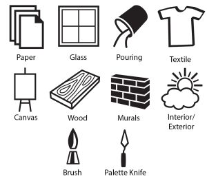
What do the surface symbols mean on your paints?
The symbols represent where the paint can be used, for example, Canvas, Murals, Glass, Textiles, and Interior/Exterior. Please visit the colour charts on the individual product pages to view the full list.
You will need to use the correct primers and finishes for a selection of surfaces, i.e., murals will need a varnish to make them waterproof and a primer on most wall surfaces to get the full colour. We do always recommend trialling on a small area and testing first.
Are your products non-hazardous?
What type of palette should you use with which type of paint?
What is the difference between artists and student colours?
What do all the different mediums do?
What is the difference between all our inks?
What is the difference between the different whites in our ranges?
What is the advantage of using the products in the same collections for artists?
What do I do if my ink is seperated?
Why is the System3 collection good for murals?
How many times is the colour milled to create Georgian oils?
How do I paint on plastic using acrylic paints?
What medium would you recommend to a beginner watercolour artist to try out alongside Aquafine watercolour paints for some great effects?
What medium could you thin your oil paint down with and at the same time slow down the drying time?
What oils do you use in your oil paints?
What is drying oil?
Do your watercolour paints have granulation and staining properties?
How should I take care of my artist brushes?
What filament is best for what technique?
The filament of a brush can be suitable for more than one technique. This table indicates the prime technique for each filament type, but also provides a guide of suitability for the others.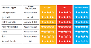
Can you explain what the different brush types do?
Would your products affect any allergies that I may have?
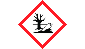
What does the hazardous symbol on the label mean?
The hazardous symbols are attributed to substances that are hazardous to the environment – these are standard symbols on artist paints.
The most standard symbol on art products is a dead tree and a dead fish symbol. This symbol means the product is toxic to marine life with long-lasting effects. Our recommendation when cleaning your products is to put the washings into a sand bin rather than down the sink.
Are your products EN71 compliant?
What are the shelf lives of your paints?
What’s the difference between water-based v solvent – based paints and why preservatives are used?
Do you sell a colour wheel?
Where can I download a product’s colour chart?
What levels are your products?
Where can I find your latest Safety Datasheets (SDS) or Technical Data sheets (TDS)
How should I store sketchbooks and drawings?
What is the difference between sketching pencils and coloured pencils?
Can I mix media on drawing paper?
What is the benefit of using different paper textures?
Why does my paper buckle when using wet media?
What is the best paper for beginners?
Can I erase easily on drawing paper?
What is the difference between sketchbooks in the range?
What drawing materials work best on Daler-Rowney sketchbooks?
Can I use watercolour on drawing paper?
What is the difference between smooth and textured drawing paper?
What is cartridge paper used for?
Can I use ink or markers on drawing paper?
What is “tooth” in drawing paper?
What is the difference between sketch paper and drawing paper?
What can I use drawing and sketching paper for?

Find a Store Near You
Our products are available in thousands stores nationwide. Use our Store Locator to find your nearest retailer and explore our network of trusted art supply specialists. Visit in person to experience the quality firsthand, receive expert advice, and shop your favourite Daler-Rowney products locally.

Contact Us
Got a question? Start by browsing our FAQs for quick answers. If you can’t find what you’re looking for, get in touch by selecting the form that best matches your enquiry. We’d love to hear from you and are always happy to assist!


